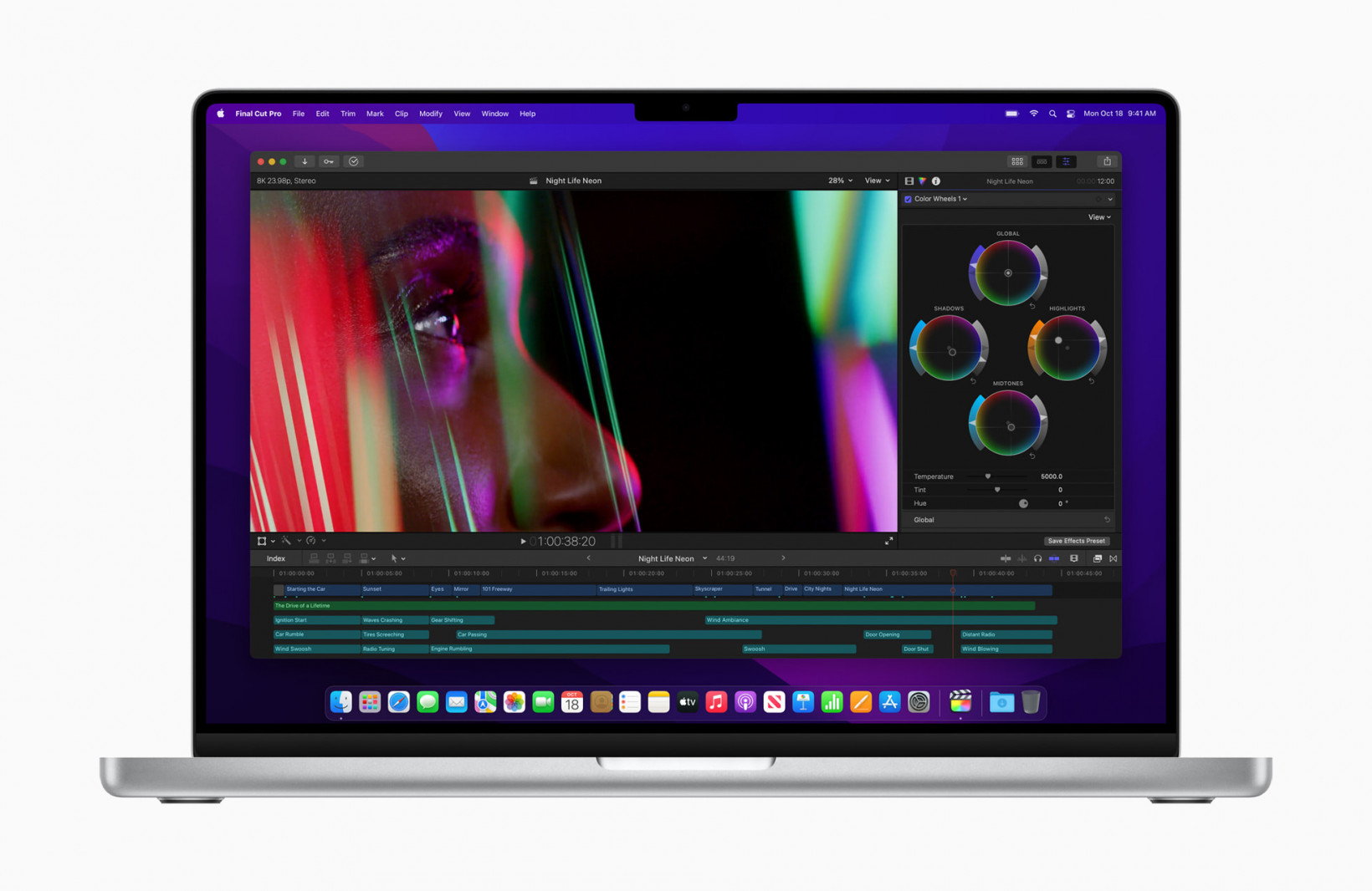
Hence, the notch on the new 14 and 16-inch MacBook Pros. When Apple introduced the notch with the iPhone X, most of us assumed it was a temporary compromise while the company figured out how to shrink the selfie camera and Face ID. But when other companies with fewer resources than Apple could get rid of the notch in favor of a much smaller cutout — or more recently, none at all — it became apparent that Apple wasn’t in all that much of a hurry to get rid of it. On a phone, the notch at least makes some sense. Face ID is a cool feature, and fitting a decent camera alongside it takes some space. But on something the size of 14 and 16-inch MacBook Pro… without even implementing Face ID? We heard the rumors but could hardly believe them to be true. The only logical explanation is that Apple wants people to see the notch and think ‘hey, that’s a MacBook Pro.’ Apple might as well trademark it.
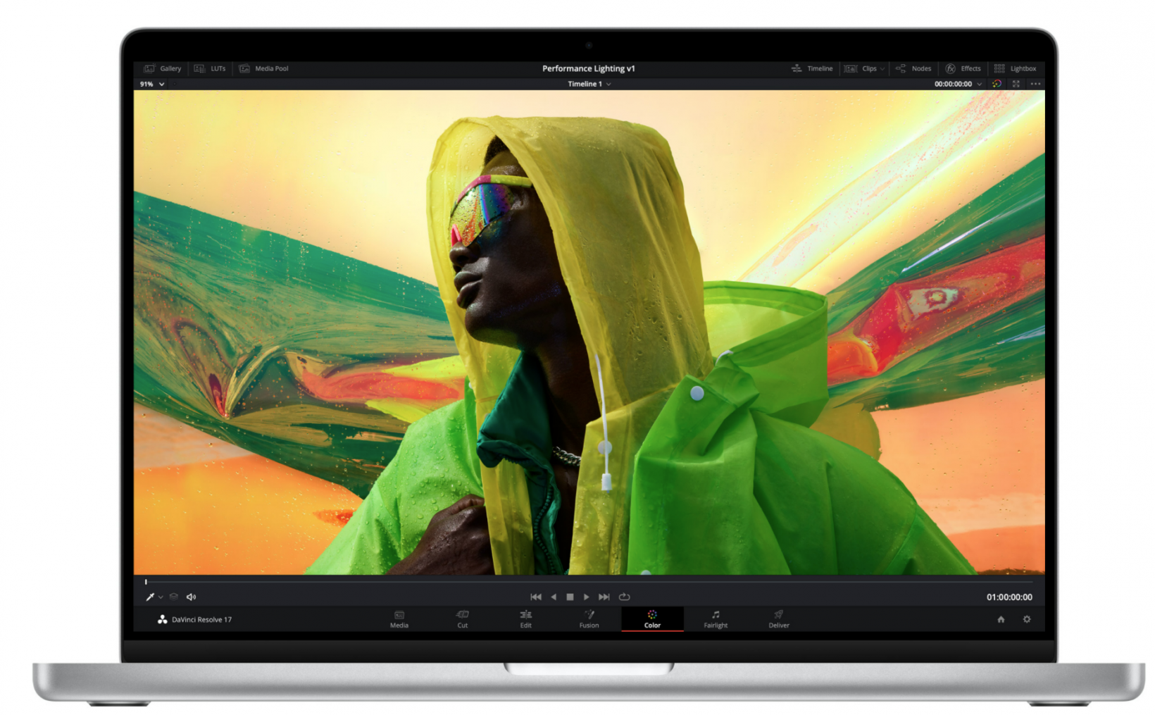
It seems like half the laptops on the market right now have a design inspired by older MacBooks, with some bordering on straight-up clones. And though MacBooks have a big Apple logo on the back — sometimes covered up — from the front, it’s become increasingly difficult to tell devices apart. You know what will make a laptop stand out in a sea of imitators? A big ol’ Notch™️. You might be thinking that the notch is just a compromise to fit in a higher-quality camera. Please. Windows laptops have been fitting webcams cameras in tiny bezels for years now, and even if the MacBook’s camera end up being better than most of its Windows counterparts, I find it hard to believe Apple couldn’t have managed to make it work in a thin, notch-less bezel if that had been a major design goal. Besides, the bottom bezel is still plenty chunky, and Apple could have shifted the display down a few millimeters if it really needed the extra space for the camera. The SurfaceLaptop Studio and HP Spectre x36016 manage to fit high-quality cameras in bezels that are just slightly larger. I’m willing to bet that’s a compromise many users would have taken. By comparison, when the notch is hidden for full-screen content, the Mac Pro’s top bezel looks as chunky as ever. Don’t get me wrong, I’m not passing judgement on the MacBook Pro just because of the notch. The laptop’s performance looks ridiculously good; the M1 Pro and Max are seemingly at least a generation ahead of their closest Windows counterparts. If I didn’t need a 2-in-1, I might actually be tempted to make the switch, and the last thing I’d be thinking about is the notch. And despite its glaring appearance, the notch isn’t even a compromise to real estate when you consider Apple heightened the overall aspect ratio to accommodate it; the portion below the notch appears to be the same 16:10 aspect ratio, as always, and the areas to the sides of the notch are just ‘extra’ pixels. Besides, it’s only a matter of time until some enterprising developer creates an app to remove the notch, and you’ll still be left with a very nice 16:10 display. But from where I’m standing, the notch could have been avoided — Apple just didn’t want to. For better or for worse, it’s another way for the company’s products to stand out in college classrooms and coffee shops. Whether on the iPhone or the MacBook Pro, don’t expect it to go away anytime soon — and don’t be surprised if it shows up on the next MacBook Air too.

