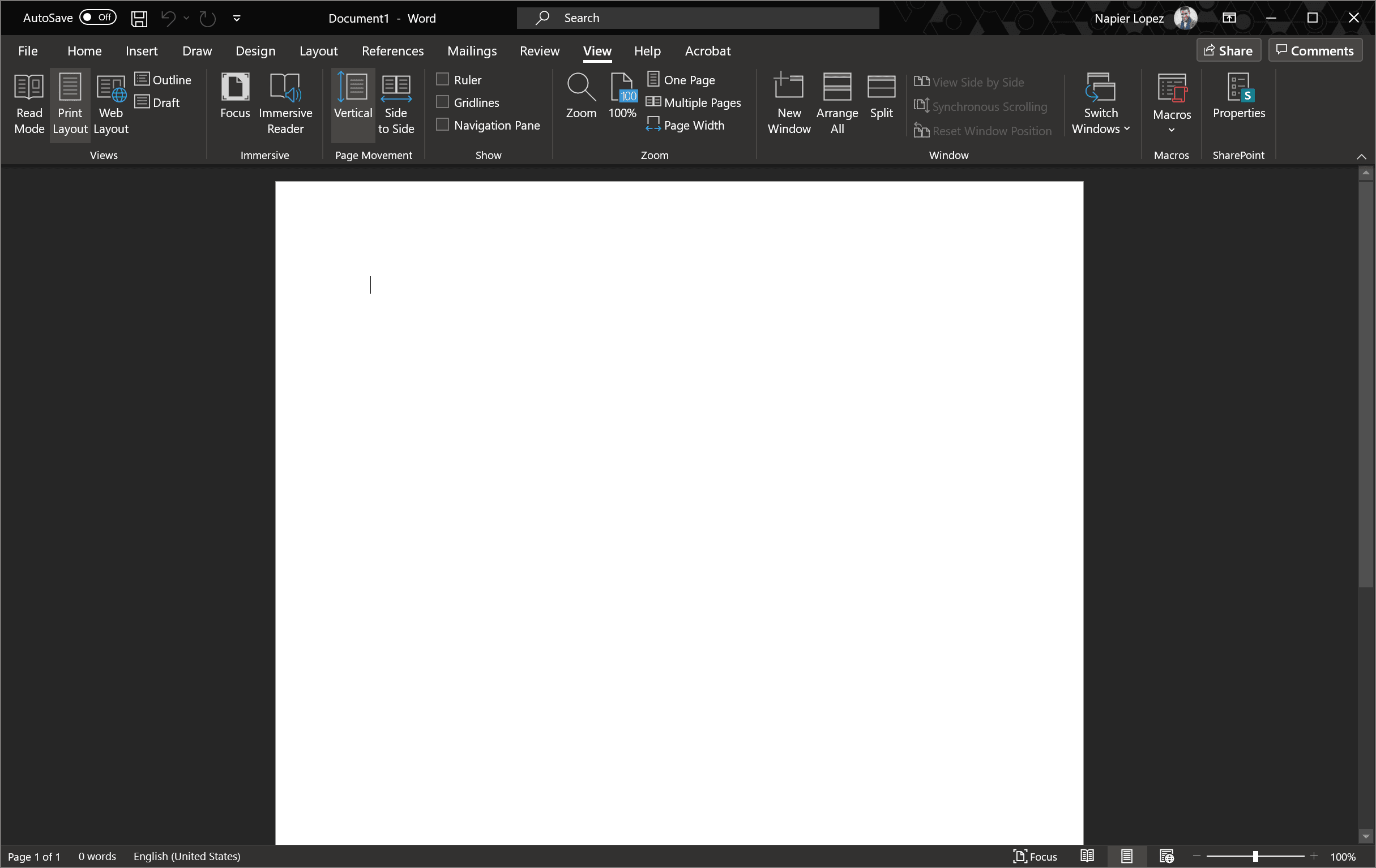
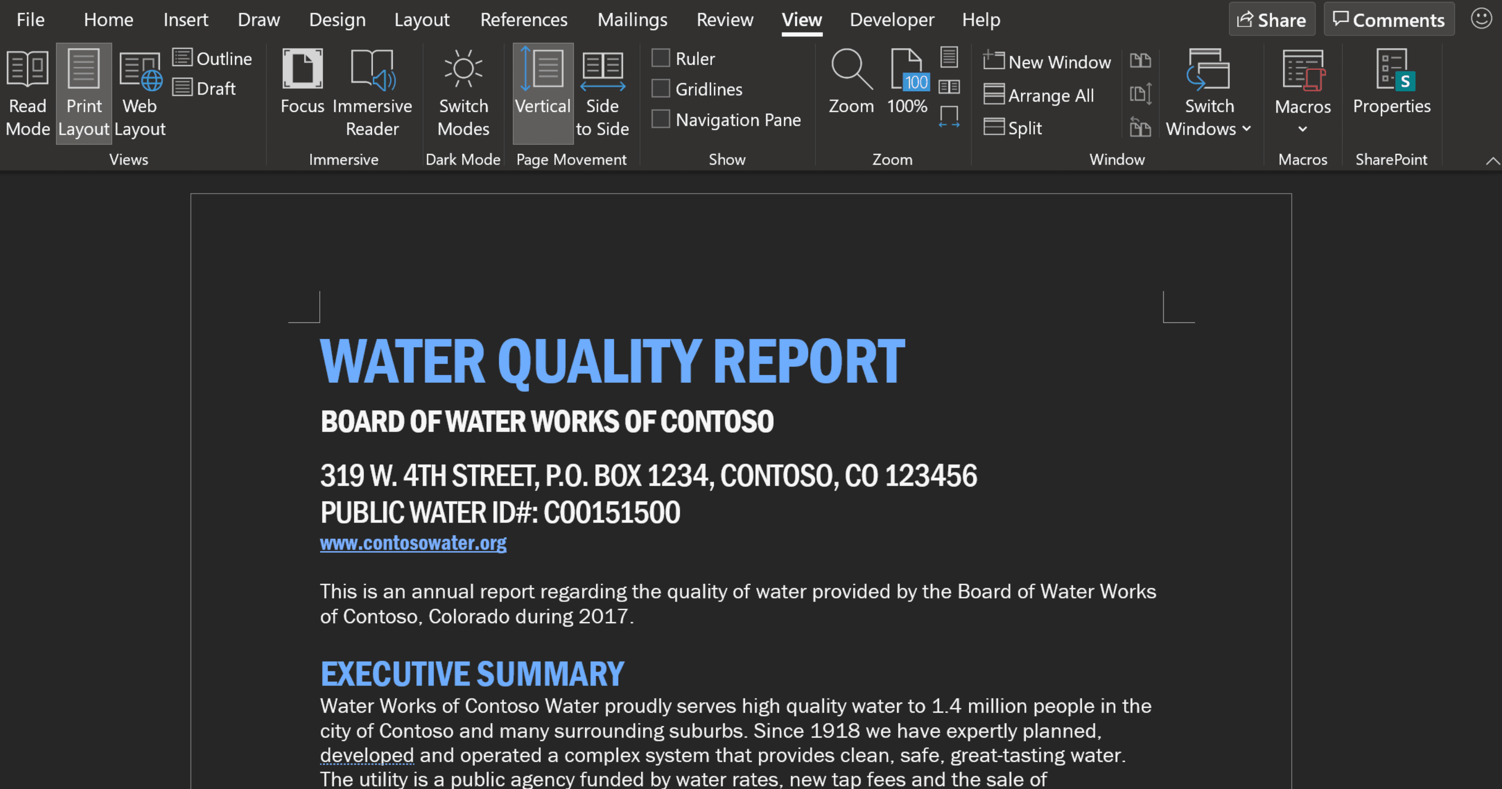
You’ve got a big chunk of white staring right at you. But as spotted by Paul Thurrott, Microsoft is currently testing a full-fledged dark mode that actually turns the white page a dark gray, and makes black text white(the feature is currently limited to Office Insiders). Colors remain the same overall hue, but “will be shifted to accommodate the new color contrast” and “mute the overall effect of the color palette and look more visually pleasing with the new dark background.” It looks like this:
To enable dark mode, simply go to File > Options > General > Personalize and select ‘Black’ From the ‘Office Theme’ menu. No, this doesn’t mean your pages will print in dark made; the feature is meant solely as an aesthetic tool during writing. To preview how the page will look when printed or shared, you can simply tap on the ‘Switch Modes’button in the ‘View’ menu. The interface will remain in dark mode, but you’ll now see the page as it would be printed. If you like the dark UI but would rather keep a white page, you head to File > Options > General > Personalize and tap on ‘Disable dark’ next to ‘Office Theme.’ It’s a welcome option. Having a big white rectangle blasting light at you kind of defeats the purpose for a lot of dark mode users. Some people use dark mode purely for aesthetic reasons, and may not mind having the actual page you’re writing on remain white so long as the interface is white. Others use dark mode to reduce the brightness of the display due to light sensitivity or to minimize blue light before sleep. Personally, I just use it because I find dark mode easier on the eyes, and less distracting at night. Unfortunately, the feature is currently only available to Beta testers signed up for Microsoft’s Insider channel. While it’s likely the feature will make its way over to the stable builds of Word — OneNote’s dark mode works much the same way — there’s no telling when exactly that might happen.

