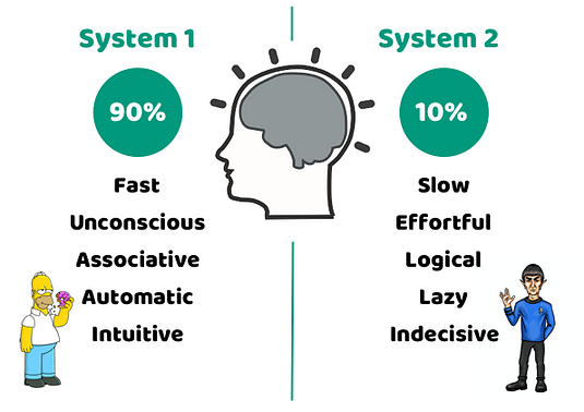
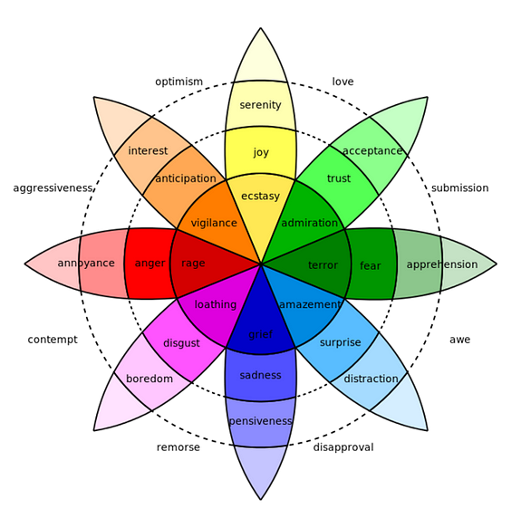
Do you view yourself as Mr. Spock when it comes to decision-making? Do you believe that you make decisions based on facts? That you consider relevant facts and make the best decision based on that? Yeah, you do. Right? And I guess you suspect where I am going with this… In this article, I will present some facts that will change the way you think about decision-making, and that are extremely useful when working as a designer. Daniel Kahneman has contributed greatly in shaping this new view on decision-making. He is a psychologist that has spent his life working on the psychology of judgment and decision-making. In 2002 he was awarded the Nobel Prize in Economics for his work on behavioral economics. He’s pretty good at what he does in other words, and in his famous book Thinking, Fast and Slow, he explains that our brain has two systems: An automatic (System 1) and the effortful (System 2). Kahneman writes: When System 2 is active we humans experience that we are in charge, we are concentrated, and we are making decisions. But System 2 consumes glucose at a fast rate so it’s not possible for us to stay in System 2 mode for too long, therefore most of our decisions are made by System 1. When System 1 makes a decision and passes it on to our awareness, to System 2, we experience that the decision made by System 1 is the intuitive one. We also experience that we have made a conscious decision even though we have not. Let me give you an example. Jonathan Gottschall describes an experiment that a team of psychologists made in his book The Storytelling Animal: How Stories Make Us Human. They placed 7 pairs of socks in a box and asked shoppers to pick the best pair. The shoppers choose a pair after examining the socks and gave a full story that explained their decision. The chosen socks had the nicest color, softest texture, etc. But, all the socks were identical. Still, the shoppers told themselves stories that made the decisions seem rational. About 90% of the time we are like Homer Simpson and 10% like Mr. Spock. Knowing this, knowing that humans communicate and make decisions unconsciously, for the most part, is valuable for us designers. Then we can choose what to communicate to their unconscious instead of leaving it to chance. And how do we communicate with the unconscious? Through basic emotions. So, what are the basic emotions? According to Neel Burton, psychiatrist, philosopher, and author of the book Heaven and Hell: The Psychology of the Emotions, the concept of basic emotions dates back at least to the first century. Basic emotions were first used in the Book of Rites, a Chinese encyclopedia that identifies seven ‘feelings of men’: joy, anger, sadness, fear, love, disliking, and liking. In the 20th century, Paul Ekman identified six basic emotions: anger, disgust, fear, happiness, sadness, and surprise, and Robert Plutchik eight, which he grouped into four pairs of opposites: joy-sadness, anger-fear, trust-distrust, surprise-anticipation. Basic emotions are unconscious and uncontrollable, and more like a reaction than a deliberate action. Working as a user experience designer I often talk about emotions with the product owner and other stakeholders. I might ask them what kind of emotions they want the user to experience while engaging with their product, and they look at me like I am some kinda crazy person. Emotions? What? That is scary! Why is this UX designer talking to us about emotions? This is often new territory for them and it can take some time before they get it. As user experience designers, we need to investigate which emotions users experience when interacting with our product. This can not be left to chance. We want the users of our products to experience emotions like joy, happiness, love. Working with user journey maps is essential but there are also a few tricks you can use to increase the positive emotions of users quite easily.
Use images and animations that make the experience feel fun and alive. Don’t underestimate the influence of a picture of a smiling face. Use emotionally loaded words like peace, love, good, successful, lucky, thankful, etc. Tell a story. Make the experience an adventure and add pleasant surprises along the journey. Also, people remember stories much better than facts. Personalize the experience. It is very pleasant when a website greets me with “Hi Dina, nice to see you again”. Use humor. A user experiencing joy is a happy user. Just don’t overdo it, and the context is super important. Limit the humor when selling insurance or legal advice.
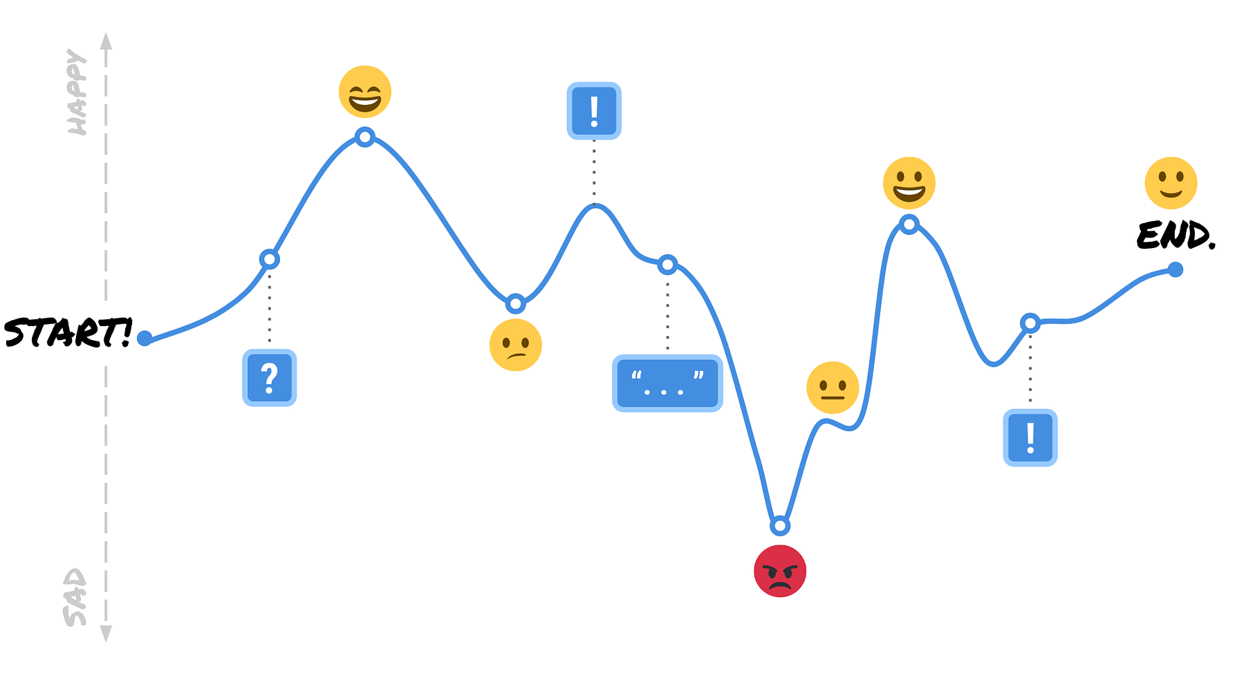
Working with journey mapping (sometimes called the Persona’s narrative) is great. By using the tool you get a nice overview of the user’s emotional experience while interacting with your product. Your main focus is to eliminate the sad/angry faces and limit the confused ones. This because bad impressions have a greater impact and are quicker to stick then good ones, according to Daniel Kahneman. The Nielsen Norman Group has a great guide on how to make user journey maps, check out “Journey Mapping 101” for more information and a template that can help you get started. I am going to end with an amazing example of how basic emotions can be used to communicate with the unconscious part of our mind. Inspired by all the cat people I work with. Five years ago flygresor.se, a Swedish flight price comparison site, made an adorable TV-commercial with kittens dressed up as airplanes flying across the world. The viewers reacted very positively to the cute kittens in the commercial and the traffic to their side and their profits increased. Still today, five years later, people in Sweden associate the website with cute kittens. Even though you can not see a single kitten image on their website. Just a pretty plain blue/white website. Today the website is the leading flight price comparison site in Sweden. It might not be only because of the cute kittens but it sure helped. This article was originally published on UX Collective by Dina Zuko. You can read the original article here.


