The whole thing was a trainwreck. It’s a situation where I feel stuck between laughter (“man, Zuckerberg really has no self-awareness”) and abject horror (“he really wants to control the future of the internet”). But I cannot let my journalistic powers be weighed down by such concerns. I have a job, nay, a public service to do. And do it I must. So, please join me on an investigation into Mark Zuckerberg’s bookshelves.
The smoking gun
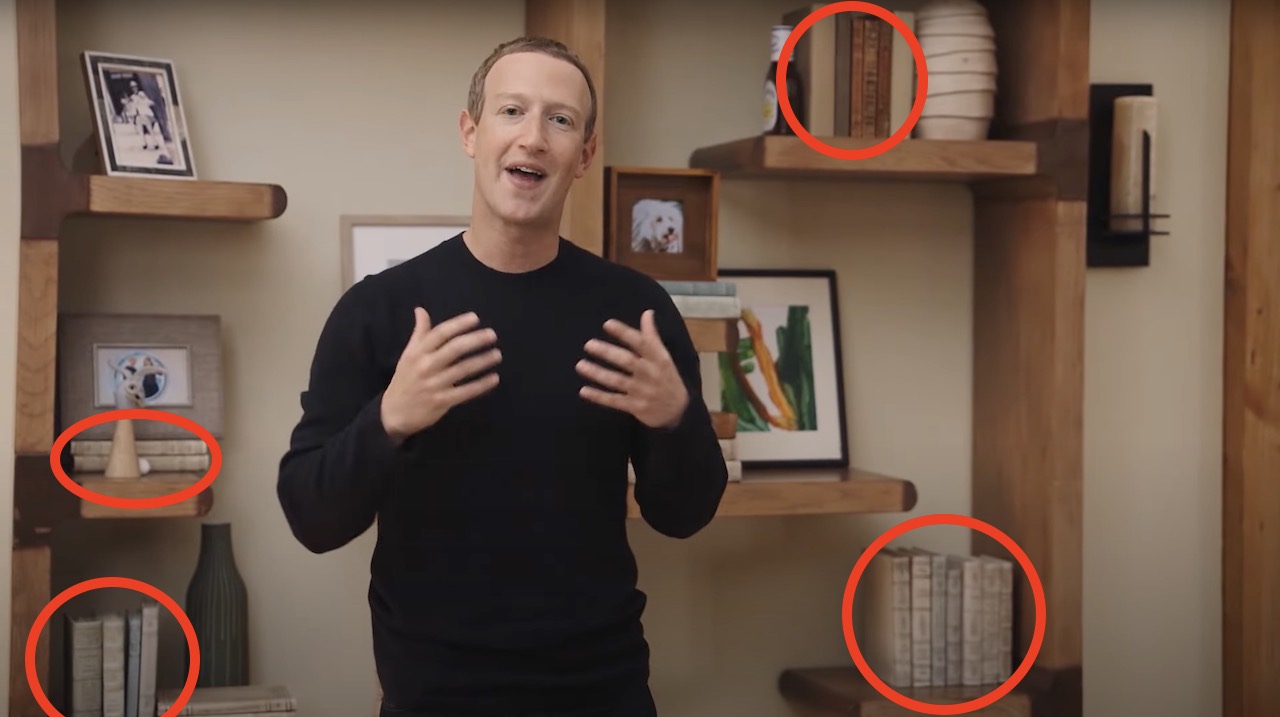
Around one minute and 45 seconds into the Facebook Connect presentation, the Zuck speaks in front of this wall: During the video, we’re confronted by one of two hypotheses about Zuckerberg’s location. Either he’s in his actual home, or a set modelled to look like it. The difference between the two is less important than you think. These are backgrounds that have clearly had great attention lavished on them. For example, observe this shot, where Zuck calmly walks past a surfboard: This would never happen in a regular house — just think of the sand and water damage from storing a surfboard in this location. Instead, it’s a knowing nod. The surfboard’s inclusion is a reference to Zuckerberg’s infamous sunscreen picture and his cringe-worth July 4th response to it. Facebook/Meta obviously wanted to go meta in Connect — which is one of the more disgusting sentences I’ve ever had to write. I’m bringing this up for a reason though: the display wall that Zuckerberg speaks in front of at the presentation’s start isn’t an accident. It’s not a collection of random objects. This has been specifically created to send a message. Our goal in this investigation is to focus on what that message is — and who’s it for.
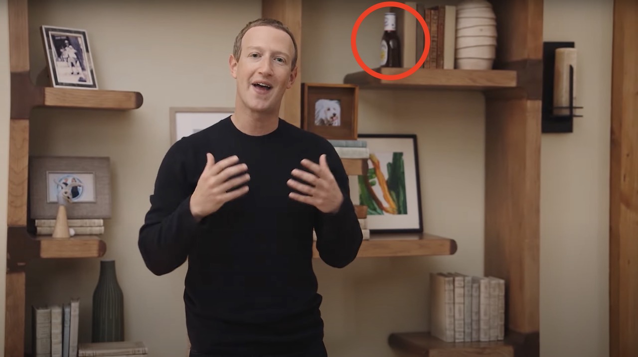
Point #1: The bottle of Sweet Baby Ray’s BBQ sauce
This is the least interesting of decorations. Social media has already been whipped up into a frenzy about this — which is precisely what Facebook/Meta wanted to happen. If you aren’t aware of the referencing, years ago, Zuckerberg released a creepy video where he repeated the words “smoking” and “meats” more times than any sane person would or should. During that same stream, he talked about his love of Sweet Baby Ray’s BBQ sauce — that’s why it appears here. It’s Zuckerberg’s PR time trying to make it clear that he’s in on the joke, that he can laugh at himself, and that he doesn’t consume the flesh of other humans to feed his robotic power cells.
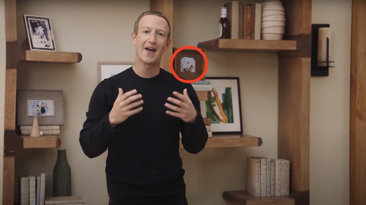
Point #2: A picture of his dog
This picture of Zuckerberg’s dog (a Puli named Beast, we can ignore the Freudian implications of that name here) is designed to humanize Zuckerberg. There are plenty of studies that connect dog ownership with responsibility and attractiveness. The message here is “trust this man who could afford to euthanize every dog on the planet, yet everyday somehow chooses not to.”
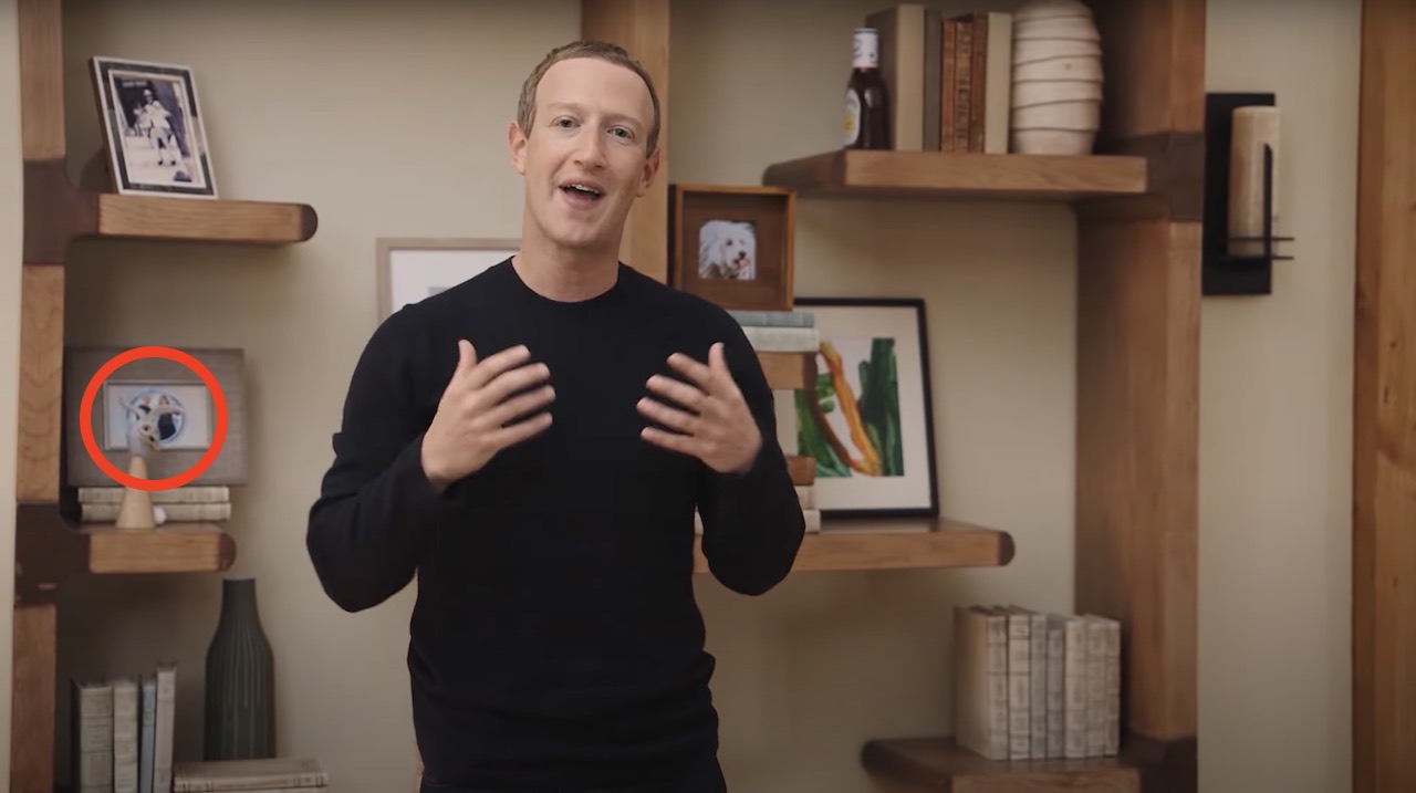
Point #3: Whatever the hell this is
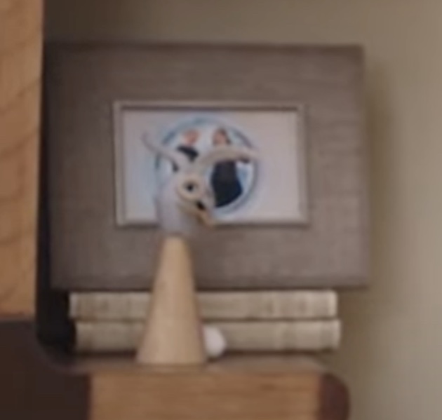
Is that a… huh? Let’s get the team down at the lab to ENHANCE THIS IMAGE: This is where things get interesting. Let’s round up what we know about this set, video, and Facebook/Meta at large.
The backgrounds are designed by a team wanting to send a message Many Facebook/Meta employees are unhappy with the company
Like any detective worth their ash-stained trenchcoat, I need to start looking beyond the obvious and find the subtext. What we have here is what appears to be a horrendous modelling of a decapitated rabbit’s head in front of a picture of Zuckberg and Priscilla Chan, his wife. You could interpret this as representing family — as the animal sculpture is most likely made by a child — but that’s the surface level. Here, a Facebook/Meta employee is warning us that any marriage between us and Zuckerberg will result in something horrendous and unnatural. That we should be revulsed.
Point #4: The painting
One assumes this a child’s painting. If that’s the case… why here? Why framed? There’s a certain uneasiness that rises from my gut when I ponder what it says about a person who frames and displays their child’s doodles, rather than simply sticking it on the fridge. This is someone who holds a belief in the power of their genetics, who believes they are exceptional. It’s meant to be cute, but the subtext is terrifying. And let’s actually look at it. Is it an onion ring on spinach leaves? A turd in the woods? Or are the childish strokes and simple color management meant to imply that this is how Zuckerberg is appearing to us? Straightforward and uncomplicated, in primary colors, all without revealing what his true message is.
Point #5: The books
None of these books are real. These are the sort of fake titles that populate IKEA showrooms. You could argue this is just done for ambience — but let’s not forget how deliberate much of this background has been. Combine this with Zuckerberg’s 2015 resolution to read 25 books in a year, and not including any actual readable titles was intentional by the set dressers. It would’ve been easy for The Zuck to bring along some of his favorite novels. So what are these empty, wordless books trying to tell us? Easy: Zuck’s idea for the metaverse is all for show and, if you scratch underneath, all you’ll find is unbearable horror of hollowness.
