Did you know that Beyonce’s website is under fire for its lack of accessibility? Or that Domino’s is fighting the Supreme Court over a website accessibility lawsuit filed by a blind customer? Lawsuits about accessibility for disabled internet users have climbed through the roof, with 2285 cases being filed in 2018 … That’s a whopping 177 percent increase over 2017. Website accessibility is big business — or, to be more specific, the lack of it is … If you thought website accessibility only mattered for governments and big business, think again. Accessibility matters to anyone who provides a product or service — public, private or volunteer. It particularly matters for small business. And paradoxically, small businesses are the ones most likely to get it wrong. The Americans with Disabilities Act (ADA) of 1990 was a landmark accomplishment for disabled people, making easier accessibility a matter of law. But since the ADA was filed before people realized the impact the Internet would have, there’s some ambiguity about what it covers on websites. Title III of that statute says places of “public accommodation” have to provide reasonable accessibility for people with disabilities. There’s been some back and forth about this in the courts for a few years, but the U.S. Department of Justice generally applies this to websites, too, with the main standard used being the Web Content Accessibility Guidelines (WCAG). That means you have a legal responsibility now to get this right. And you have a moral obligation, as well. The world runs on the Internet now. What happens when the only source you have for something is a website and you’re blind? You have to listen to the entire page being read aloud to you and pray they’ve actually done a good job with their tagging. Or you have motor issues and can’t use a mouse. Is the page laid out so you can easily tab through? Disabled people have the right to the same experience that able people do, or as close as we can get it. It’s not only a moral and legal obligation, it’s an economic one, as well. At last count there were 57 million people in the United States living with a disability. That’s a huge potential market you could be missing out on. Despite the fact that technology can often make the lives of disabled people easier, they’re also less likely to use it — partly due to lack of accessibility. Ask Vint Cerf, inventor of TCP/IP, often called a Father of the Internet alongside other early Web pioneers. He’s hearing-impaired and his wife is deaf, and the Internet opened doors for them they’d never had before. Email in particular allowed them access to easy text communication for the first time. But he’s sounding a warning about accessibility in the current age of the Web. “It can’t be a pixie dust that you sprinkle on top of the program and suddenly make it accessible, which is the behavior pattern in the past,” Cerf says. “We need to build in these things from the beginning.” He’s been encouraged by recent developments in voice assistance, but feels there’s still work to do. When you’re building a site for accessibility there are a few different areas you should focus on … Here’s how to get started:
1) Let users turn off video/GIF content
Epileptic users in particular are worried about something suddenly triggering a seizure. The Internet is full of videos and moving, flashing pictures that can cause epileptic attacks, so most of these users will try to turn off all animations while they’re surfing the net. For example, take Kurt Eichenwald, an epileptic journalist who was attacked remotely via people sending him epilepsy-inducing GIFs. Videos can often do this unintentionally by showing blinking or rapidly flashing images. That autoplay video on your page isn’t just annoying your users — it’s a loaded gun for people who suffer from epilepsy. That’s why you should use an opt-in for all of your video and animated GIF content. Make sure nothing can play until the user decides to trigger it. Control access to everything that could be an issue, and make sure your epileptic users aren’t going to find a trigger. Be aware of what your videos can do to people who are vulnerable.
2) Create transcripts and captions for video
Video content is particularly problematic for accessibility. For deaf users in particular, even subtitled video often isn’t enough. There’s a difference between subtitles and captions. Subtitles assume that the user can still hear, but either doesn’t understand the language or is in a noisy environment. Sounds like a car horn or a ringing phone can still be heard and processed. Captions are different. Captions note all significant audio events on the video so that deaf or hearing-impaired people can still understand what’s going on. They make it possible for them to experience the video the way it’s meant to be experienced. Transcripts are useful for this, also. And as a side bonus, transcripts are great for other tasks you might be asked to perform, like creating subtitles for different languages. They even help with search engine optimization. They’re an essential task to make any website accessible and ADA compliant, but if you have a lot of videos on your site, it can be a very daunting task. Transcripts and captions take a lot of time and effort to prepare and if you have a lot of video content it’s going to be an uphill road to get to ADA compliance.
3) Tag photos, graphics and buttons
Have you ever turned on voice assistance in your browser and tried to navigate using it? Visually-impaired people have to listen to every element on a page before they can figure out what they want to do. And if you’re not tagging your photos, graphics and buttons, you’re cutting them off at the knees. If the elements on your page lack tags, you’re leaving your visually-impaired users completely devoid of information. They can’t hear what you’re trying to tell them. You might as well have given them a blank page.
Even if you’re short on time, make the effort to tag all of the visual elements on your page with clear, concise, readable captions. Your visually-impaired users will thank you.
4) Simplify autocomplete for forms
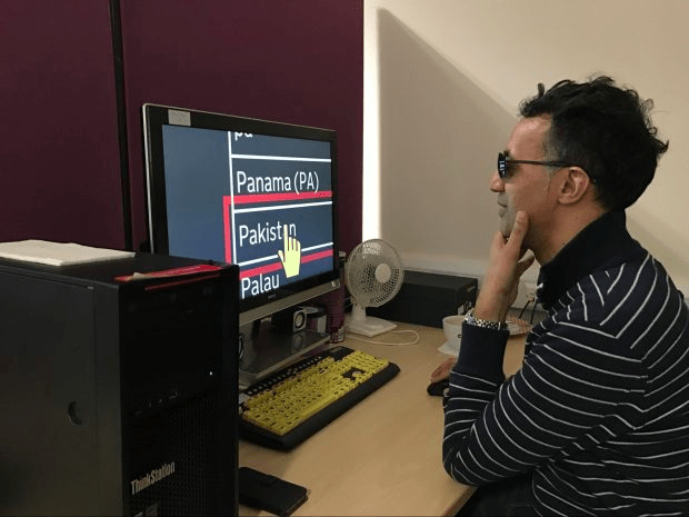
When Great Britain’s civil service was trying to build its websites to work for disabled internet users, it didn’t just guess. It actually invited people to test. The results were illuminating …
When it came to filling out forms, the program was substandard. Though it allowed for a lot of the functionality the development team intended, there were still some significant gaps and bugs. Much of it stemmed from the voice control programs that they were using, which didn’t recognize every option the website was providing. If you’re trying to put together a form for disabled internet users, you need to be aware of what they need. When visually-impaired users try to fill forms, they may need a reader program to read out each field, and autocomplete helps them fill in without worrying about typing. People with motor control issues also use autocomplete extensively so they don’t have to type or mouse as much. Even people who suffer from dyslexia can benefit from autocomplete. Automatically completing forms is something most modern web browsers help users do, but if your disabled users can’t choose the correct options, it’s not even worth their time to try … Take the time to get it right.
5) Make accessibility easy to find
For companies who design software or web apps, it can be easy to say, “Sure, we have an accessibility option in there.” But how easy is it to get to?
If you’re trying to make accessibility easier for people, it needs to start with the people who are doing the design. Accessibility has to be in the design guidelines from the very beginning to make it a considerable component of the website which disabled users can easily find in every web page. If you’re using an accessibility plugin that is visible at all times and think you’ve got this covered, you need to be aware that most accessibility plugins don’t adhere to 100 percent of the WCAG 2.1 standards. It’s more like five to 15 percent. From the very beginning, the code and infrastructure have to be built with WCAG 2.1 standards in mind. Clarity in design matters a lot for disabled users. For blind or visually-impaired people in particular, having an accessibility option close to the top of the page makes it easier for them to find with a screen reader. It also needs to be clearly visible and high-contrast. Coherent site design helps people with disabilities find what they need. Make it easy for them to turn on accessibility features. Design your site clearly.
6) Increase the size of clickable areas
For people who have motor or visual difficulties, small links and form buttons can be hard to target. It’s not hard to make your hyperlinks bigger so they encompass more text. This allows people with motor problems to click the link more easily. It also allows people with visual problems to find the link in the first place Increasing the size of elements on the page can help people with both issues, but this can cause other problems, too. For example, if the text doesn’t reflow correctly, it can be hard to navigate and read at larger sizes, especially for many older people who may have a combination of visual, motor and short-term memory issues. It’s easy for them to lose track of where they are in the page. Make sure your site is adaptive, even at larger sizes. It’s a simple change, but it can make a huge difference.
Proper accessibility takes time and money you might not want to spend … But it’s absolutely worth it. When the UK Government decided to measure how much money they were losing as a result of their sites not having the accessibility that disabled users require, they found that they were losing over 11 billion pounds per year from disabled users bouncing from sites. You could be leaving money on the table. You could also be putting yourself in a bad legal position, especially as ADA compliance with the WCAG 2.1 standard becomes more common. If you’re not catering equally to your disabled clients just as much as your able ones, you’re at risk of receiving a nasty demand letter followed by a crushing lawsuit. If you want to become ADA and WCAG 2.1 compliant, there’s hope. You can take the time to fix everything manually, but there are also services that will help you make your websites ADA and WCAG 2.1 compliant. Companies like accessiBe, for example, use innovative AI technology to automatically find areas of your website that don’t meet ADA standards. They’ll help you get to WCAG 2.1 compliance, opening up new markets and helping you avoid costly lawsuits. So, considering the risk of facing a lawsuit and the money you’re leaving on the table, why wait? Don’t miss out on a market that you could dominate. If you’re willing to put some effort in to serve disabled users, your efforts will pay dividends and avoid the huge expenses that can come from lawsuits. Serve your disabled internet users the same as your regular users — make your website accessible.


